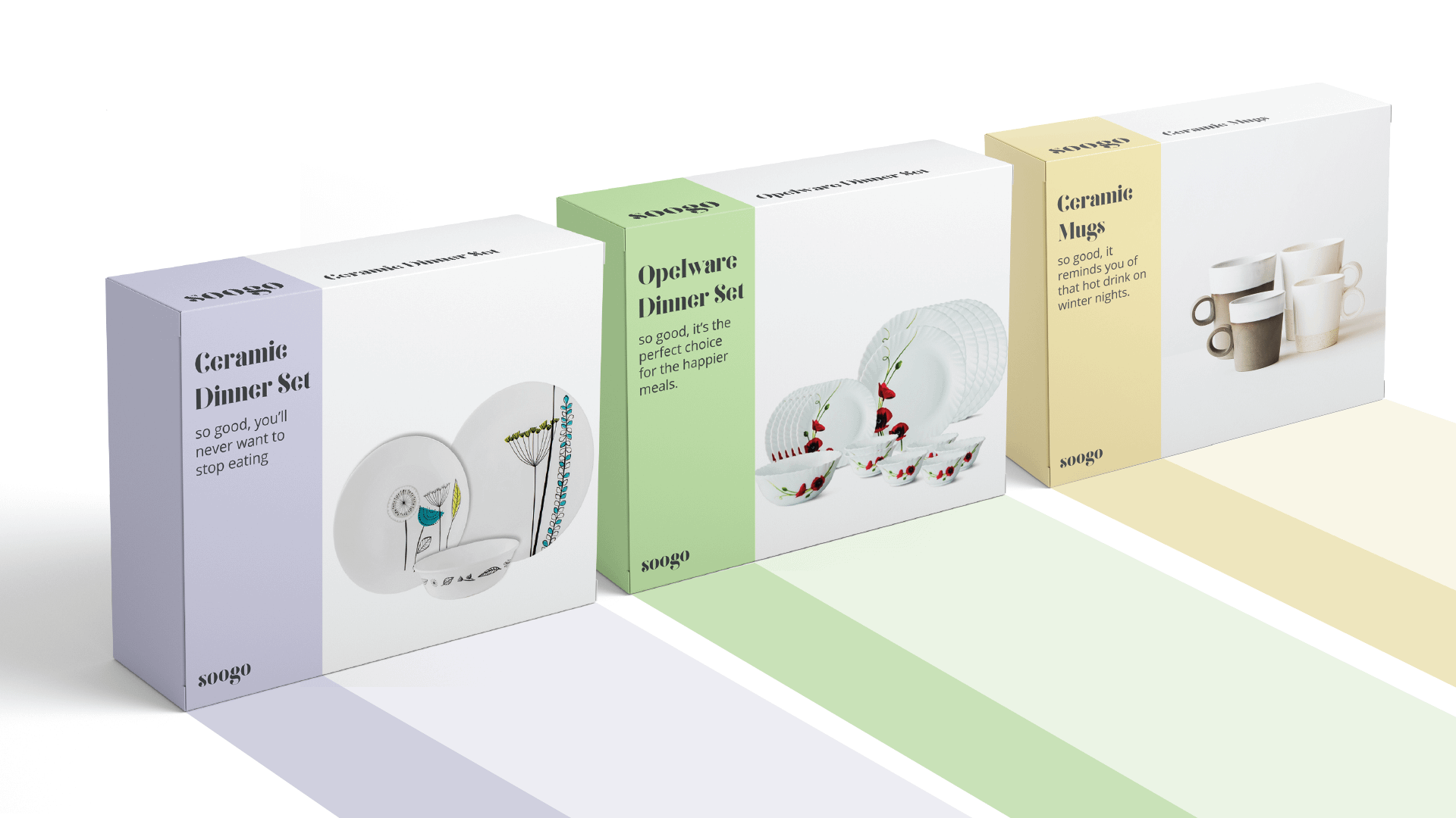
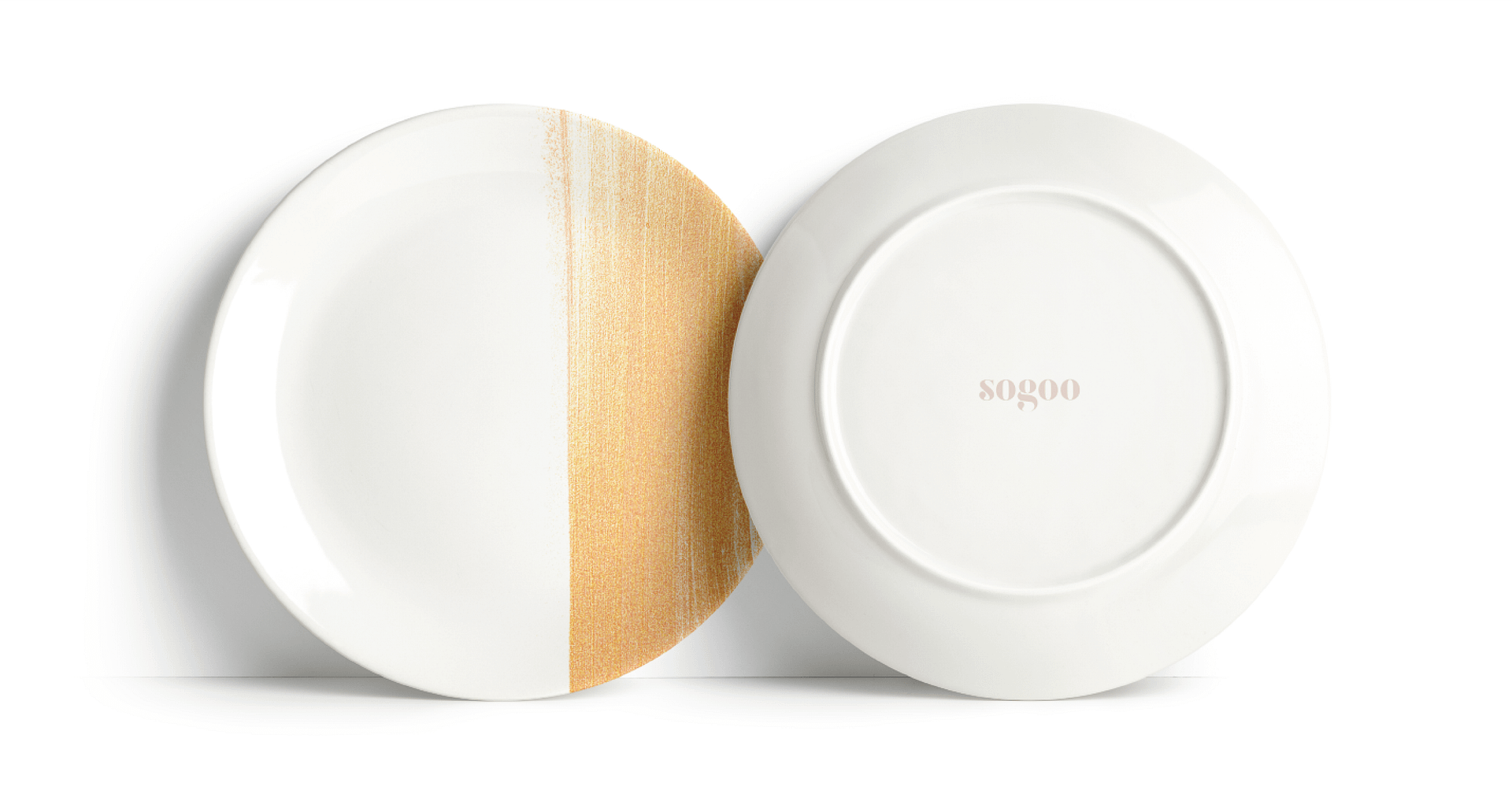
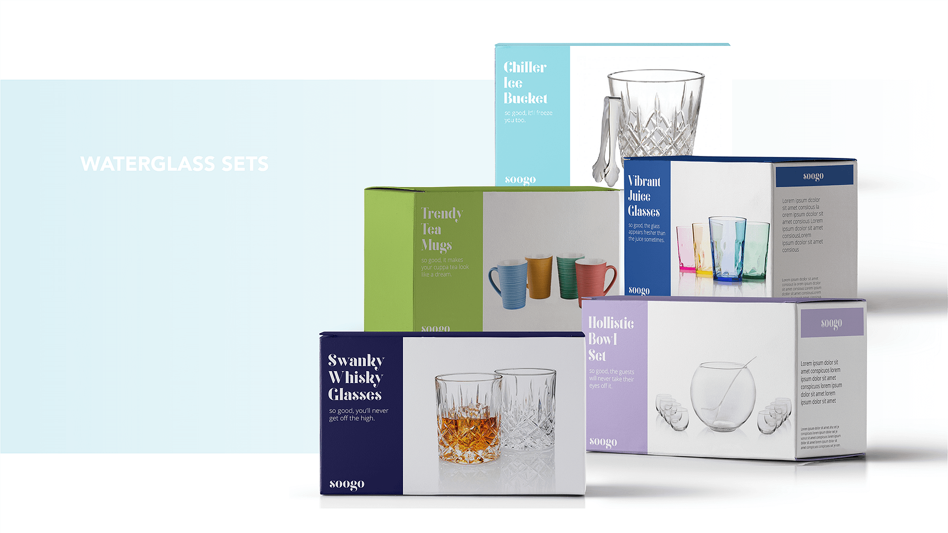
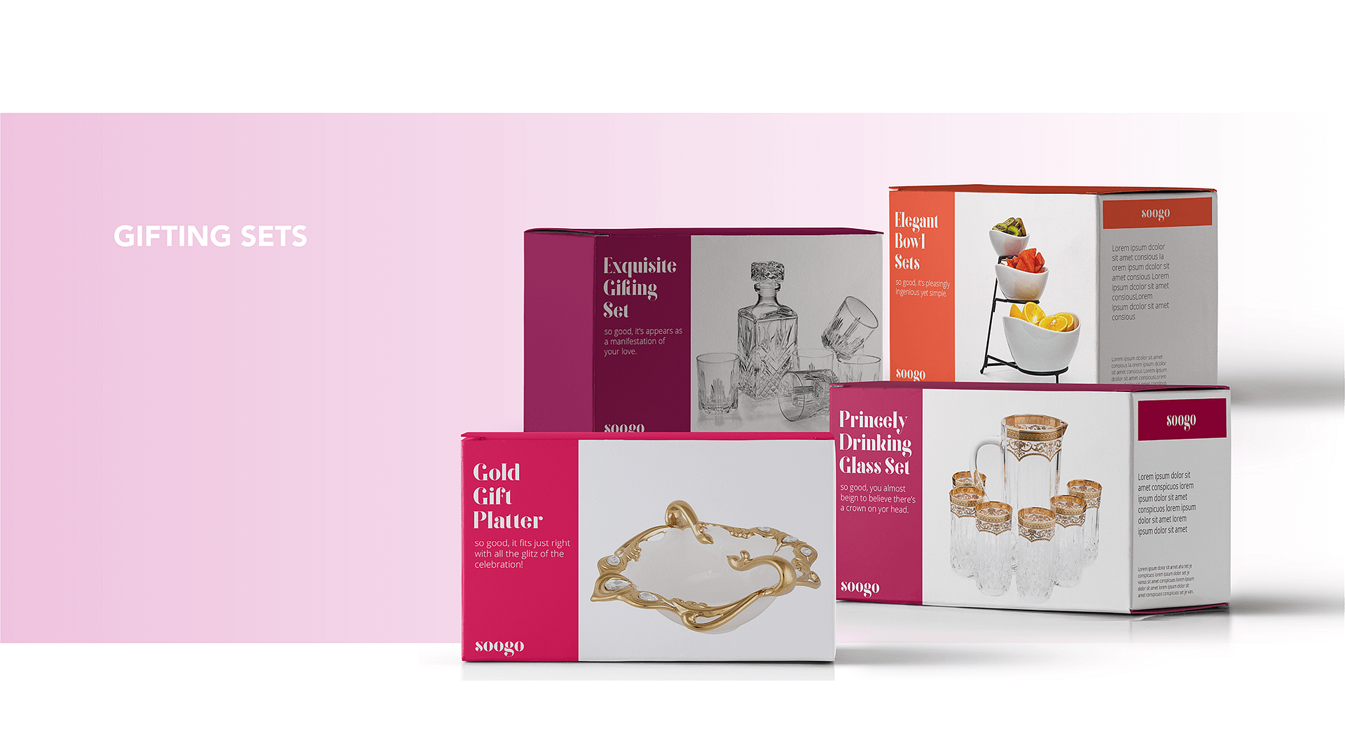
About the project
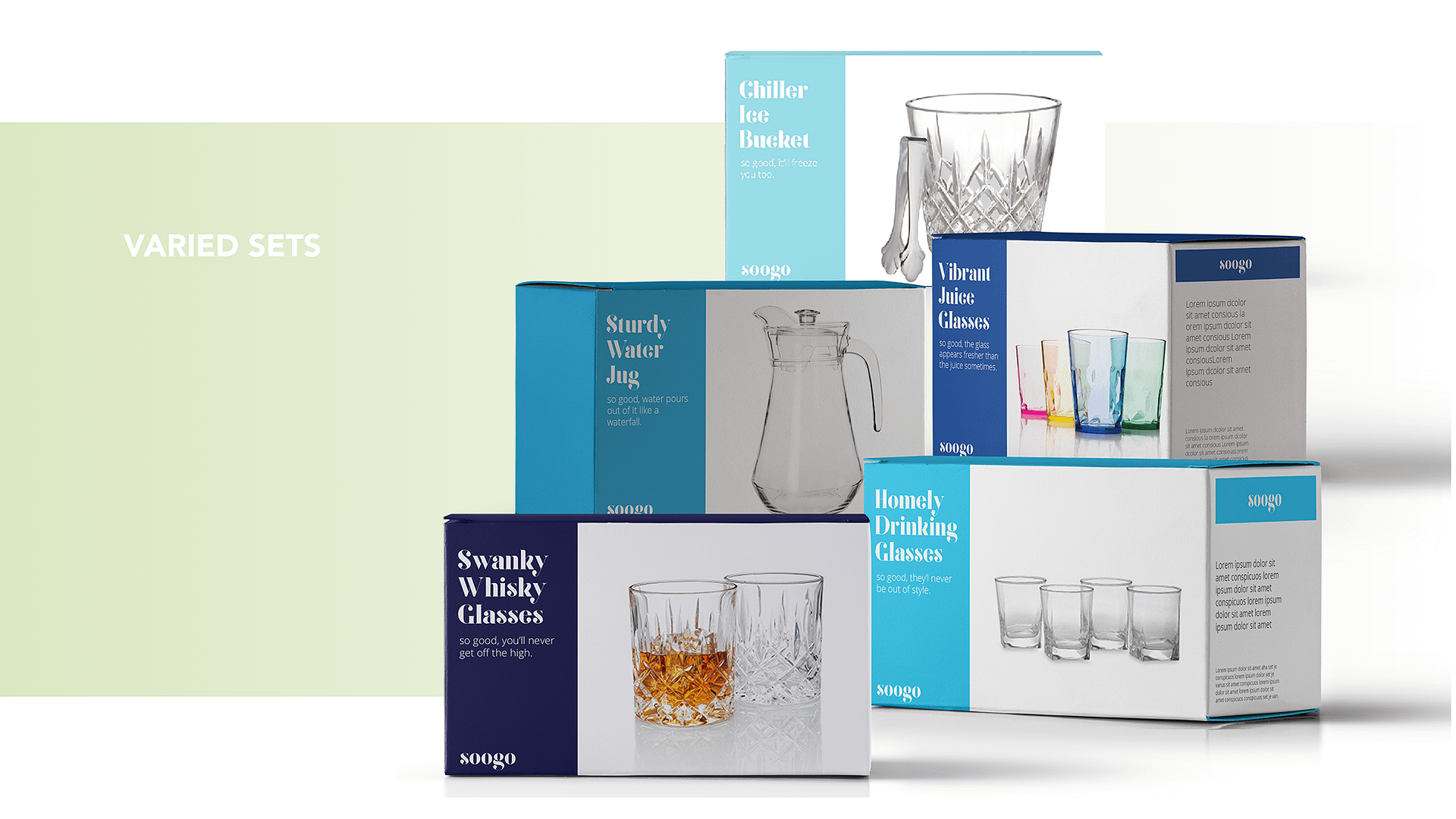
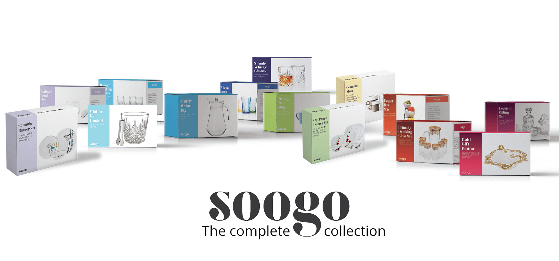
A brand that makes you happy in ways more than one, because it’s ‘so good’. Soogo, a silent part of multiple homes all across India now takes on a loud and clear stance with what it delivers; driven by typography, it speaks a no-nonsense language and opens itself to a wide range of colours spreading joy with quality, affordable homeware. Strategic brand development and redesign were worked upon to reposition a brand that has been growing for decades.